数据分析之数据可视化之美 -- 以Matlab、Python为工具
来源:科象教育
本篇介绍了数据分析之数据可视化之美 -- 以Matlab、Python为工具,通过具体的内容展现,希望对大家数据分析数据可视化的学习有所帮助。

# GIF source code (example 8)
# https://mianbaoduo.com/o/bread/mbd-YpWVlppt
在我们科研、工作中,将数据完美展现出来尤为重要。
数据可视化是以数据为视角,探索世界。我们真正想要的是 — 数据视觉,以数据为工具,以可视化为手段,目的是描述真实,探索世界。
下面介绍一些数据可视化的作品(包含部分代码),主要是地学领域,可迁移至其他学科。
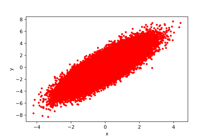
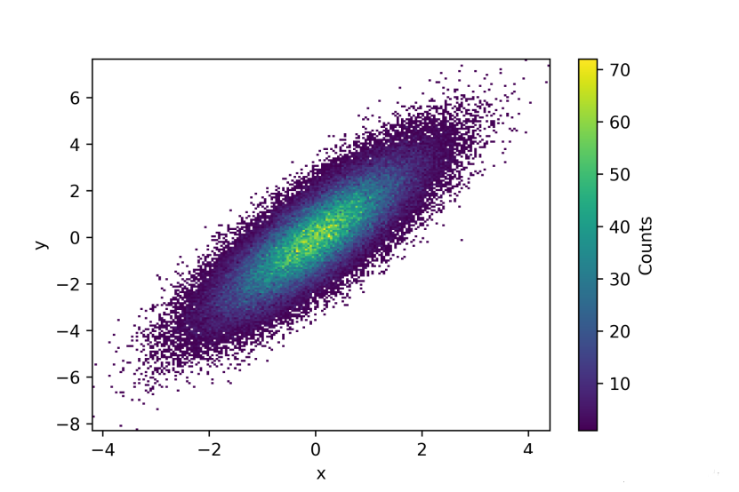
Example 1 :散点图、密度图(Python)
import numpy as np
import matplotlib.pyplot as plt
# 创建随机数
n = 100000
x = np.random.randn(n)
y = (1.5 * x) + np.random.randn(n)
fig1 = plt.figure()
plt.plot(x,y,'.r')
plt.xlabel('x')
plt.ylabel('y')
plt.savefig('2D_1V1.png',dpi=600)
nbins = 200
H, xedges, yedges = np.histogram2d(x,y,bins=nbins)
# H needs to be rotated and flipped
H = np.rot90(H)
H = np.flipud(H)
# 将zeros mask
Hmasked = np.ma.masked_where(H==0,H)
# Plot 2D histogram using pcolor
fig2 = plt.figure()
plt.pcolormesh(xedges,yedges,Hmasked)
plt.xlabel('x')
plt.ylabel('y')
cbar = plt.colorbar()
cbar.ax.set_ylabel('Counts')
plt.savefig('2D_2V1.png',dpi=600)
plt.show()
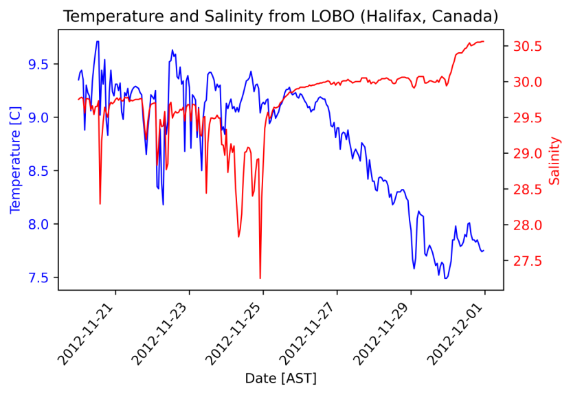
Example 2 :双Y轴(Python)
import csv
import pandas as pd
import matplotlib.pyplot as plt
from datetime import datetime
data=pd.read_csv('LOBO0010-2020112014010.tsv',sep='\t')
time=data['date [AST]']
sal=data['salinity']
tem=data['temperature [C]']
print(sal)
DAT = []
for row in time:
DAT.append(datetime.strptime(row,"%Y-%m-%d %H:%M:%S"))
#create figure
fig, ax =plt.subplots(1)
# Plot y1 vs x in blue on the left vertical axis.
plt.xlabel("Date [AST]")
plt.ylabel("Temperature [C]", color="b")
plt.tick_params(axis="y", labelcolor="b")
plt.plot(DAT, tem, "b-", linewidth=1)
plt.title("Temperature and Salinity from LOBO (Halifax, Canada)")
fig.autofmt_xdate(rotation=50)
# Plot y2 vs x in red on the right vertical axis.
plt.twinx()
plt.ylabel("Salinity", color="r")
plt.tick_params(axis="y", labelcolor="r")
plt.plot(DAT, sal, "r-", linewidth=1)
#To save your graph
plt.savefig('saltandtemp_V1.png' ,bbox_inches='tight')
plt.show()
Example 3:拟合曲线(Python)
import csv
import numpy as np
import pandas as pd
from datetime import datetime
import matplotlib.pyplot as plt
import scipy.signal as signal
data=pd.read_csv('LOBO0010-20201122130720.tsv',sep='\t')
time=data['date [AST]']
temp=data['temperature [C]']
datestart = datetime.strptime(time[1],"%Y-%m-%d %H:%M:%S")
DATE,decday = [],[]
for row in time:
daterow = datetime.strptime(row,"%Y-%m-%d %H:%M:%S")
DATE.append(daterow)
decday.append((daterow-datestart).total_seconds()/(3600*24))
# First, design the Buterworth filter
N = 2 # Filter order
Wn = 0.01 # Cutoff frequency
B, A = signal.butter(N, Wn, output='ba')
# Second, apply the filter
tempf = signal.filtfilt(B,A, temp)
# Make plots
fig = plt.figure()
ax1 = fig.add_subplot(211)
plt.plot(decday,temp, 'b-')
plt.plot(decday,tempf, 'r-',linewidth=2)
plt.ylabel("Temperature (oC)")
plt.legend(['Original','Filtered'])
plt.title("Temperature from LOBO (Halifax, Canada)")
ax1.axes.get_xaxis().set_visible(False)
ax1 = fig.add_subplot(212)
plt.plot(decday,temp-tempf, 'b-')
plt.ylabel("Temperature (oC)")
plt.xlabel("Date")
plt.legend(['Residuals'])
plt.savefig('tem_signal_filtering_plot.png', bbox_inches='tight')
plt.show()
Example 4:三维地形(Python)
# This import registers the 3D projection
from mpl_toolkits.mplot3d import Axes3D
from matplotlib import cbook
from matplotlib import cm
from matplotlib.colors import LightSource
import matplotlib.pyplot as plt
import numpy as np
filename = cbook.get_sample_data('jacksboro_fault_dem.npz', asfileobj=False)
with np.load(filename) as dem:
z = dem['elevation']
nrows, ncols = z.shape
x = np.linspace(dem['xmin'], dem['xmax'], ncols)
y = np.linspace(dem['ymin'], dem['ymax'], nrows)
x, y = np.meshgrid(x, y)
region = np.s_[5:50, 5:50]
x, y, z = x[region], y[region], z[region]
fig, ax = plt.subplots(subplot_kw=dict(projection='3d'))
ls = LightSource(270, 45)
rgb = ls.shade(z, cmap=cm.gist_earth, vert_exag=0.1, blend_mode='soft')
surf = ax.plot_surface(x, y, z, rstride=1, cstride=1, facecolors=rgb,
linewidth=0, antialiased=False, shade=False)
plt.savefig('example4.png',dpi=600, bbox_inches='tight')
plt.show()